Ivent is a digital platform designed to help users create, manage, and explore events in a simple and structured way.
The goal of the project was to improve the overall experience of event creation and navigation, reducing friction and making the platform easier to understand for both first-time and recurring users.
My role
I worked on this project as a UX/UI Designer, being responsible for:
Defining user flows
Creating information architecture
Designing wireframes and high-fidelity UI
Making design decisions focused on hierarchy and usability
My Design Process
1. Understanding the problem
Ivent was designed to truly connect with the creative community by making it easier to discover, understand, and attend relevant events.
Users often struggled to find events that matched their interests, while poorly structured information and visually dense interfaces made exploration unnecessarily hard. Instead of feeling inspiring, browsing events became overwhelming.
The main challenge wasn’t adding more content, but simplifying how events were presented—so users could explore, decide, and attend events with confidence.
2. Defining the experience
Based on these insights, I restructured the flow to guide users more naturally through the process, focusing on clarity, hierarchy, and ease of use.
Key decisions included:
Reducing visual noise and unnecessary elements
Grouping information logically
Highlighting primary actions to avoid hesitation
Designing predictable and consistent patterns across screens
Beyond usability, a corporate identity system was also created to reinforce a sense of community and belonging around the platform.
The visual language — including color, shape, and consistency across components — was designed to make users feel part of a shared space, not just users completing isolated tasks. The goal was to create a cohesive, end-to-end experience where product, brand, and interaction work together seamlessly.
Ultimately, the objective was to let users focus on their task without having to think about the interface itself — while still feeling connected to the platform and the community behind it.
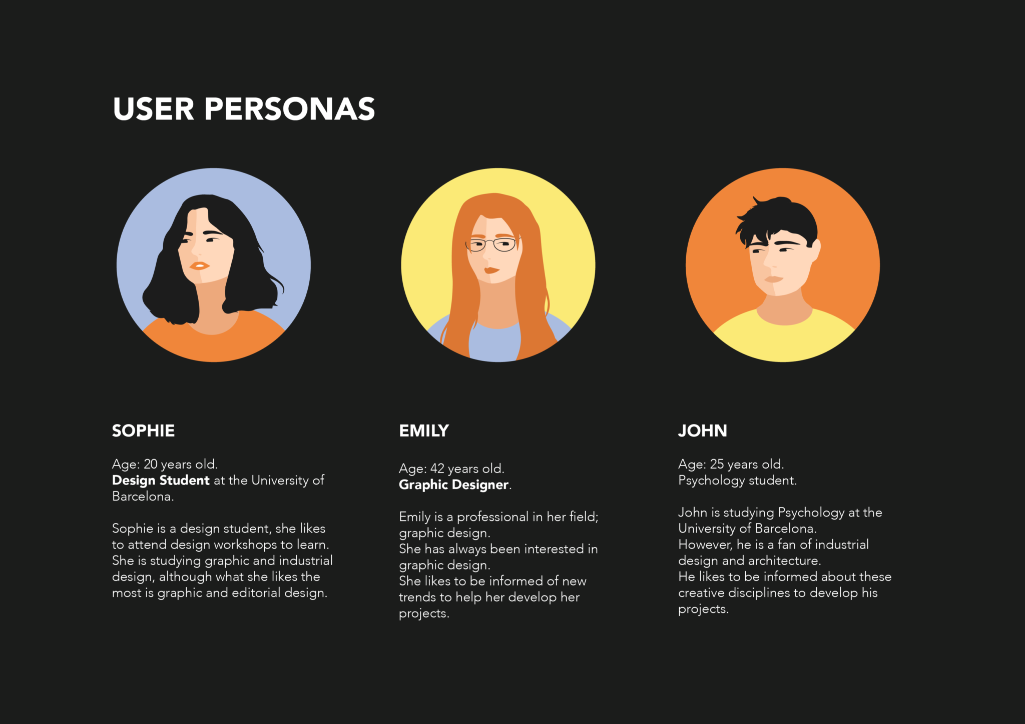
3. UX Research & User Personas
Before defining the user personas, I conducted a qualitative research phase focused on understanding how different creative profiles discover, join, and engage with events.
I interviewed several creative candidates — including students, professionals, and people from adjacent disciplines — to learn about their motivations, habits, and frustrations when looking for design-related events and experiences.
These conversations helped reveal clear patterns:
Different levels of experience, but similar expectations around clarity and relevance
A strong interest in learning and community, not just attending isolated events
The need for a platform that feels approachable, structured, and easy to navigate
Based on these insights, I synthesized the findings into three core user personas. Rather than representing individual users, these personas reflect recurring behaviors and needs observed during the research phase, and were used to keep design decisions grounded throughout the project.
4. Design & iteration
Wireframes were used early on to validate layout and structure before moving into high-fidelity design.
During this phase, I iterated mainly on:
Navigation clarity
Button hierarchy
Spacing and readability
Consistency across screens
As the product grew, it became clear that consistency couldn’t rely only on individual screens. To support this, I created a custom design system derived directly from the modular corporate identity.
Components, spacing rules, colors, and interaction patterns were defined as part of a shared system, ensuring that every detail — from icons to layouts — felt connected and intentional. This helped the product scale visually without losing coherence.
Each design choice aimed to answer a simple question: Does this make the experience easier and faster for the user?
5. Outcome & impact
The final solution resulted in:
A more intuitive event creation flow
Clearer navigation and decision-making
Reduced cognitive load through better hierarchy
A calmer, more focused interface
Although this was a conceptual project, the design decisions were based on real usability principles and reflect how small changes in structure and hierarchy can significantly improve user experience.
Key learnings
This project highlighted the importance of alignment between visual identity, community, and product experience.
Designing the interface was only one part of the process. What really made the difference was ensuring that branding, design system, and UX decisions worked together as a single, coherent whole.
When visual language, interaction patterns, and product behavior are consistent, the experience feels more natural and trustworthy. Users don’t need to adapt to the product — the product adapts to them.
This reinforced a key learning for me: strong experiences are built through harmony, not isolated design decisions.
Why this project matters
This project matters because it goes beyond interface design.
Ivent is an example of an end-to-end product process, covering UX research, branding, design system creation, and UX/UI design. It shows how these disciplines can work together to shape a cohesive product, rather than existing as disconnected phases.
The project reflects my ability to think in terms of structure, scalability, and long-term coherence (not just individual screens) and to translate abstract ideas like community and identity into concrete design decisions.